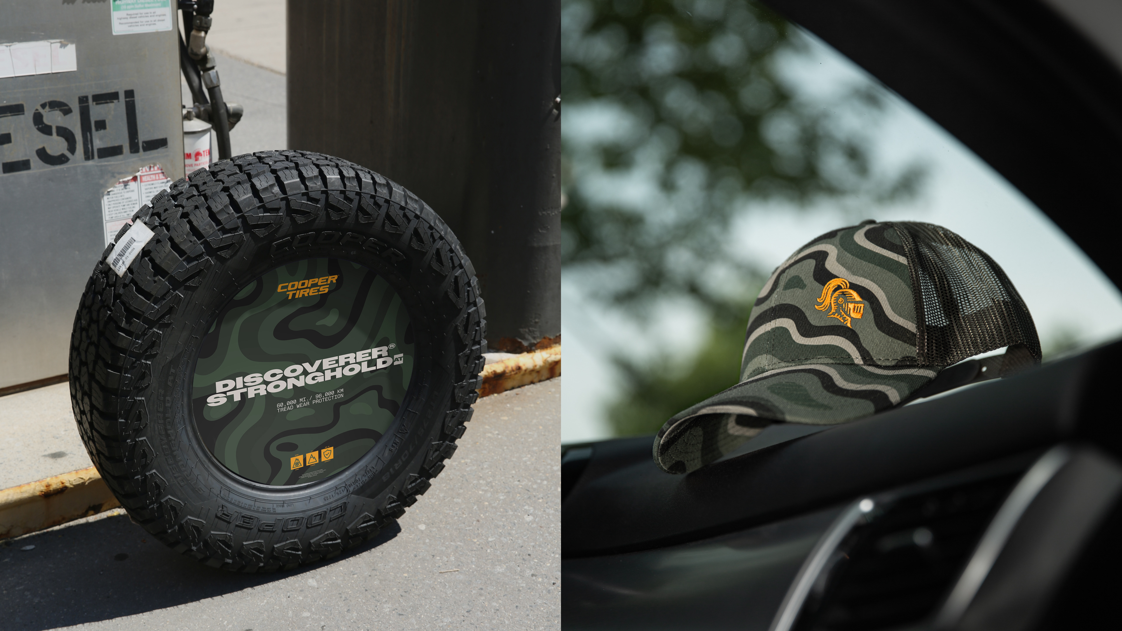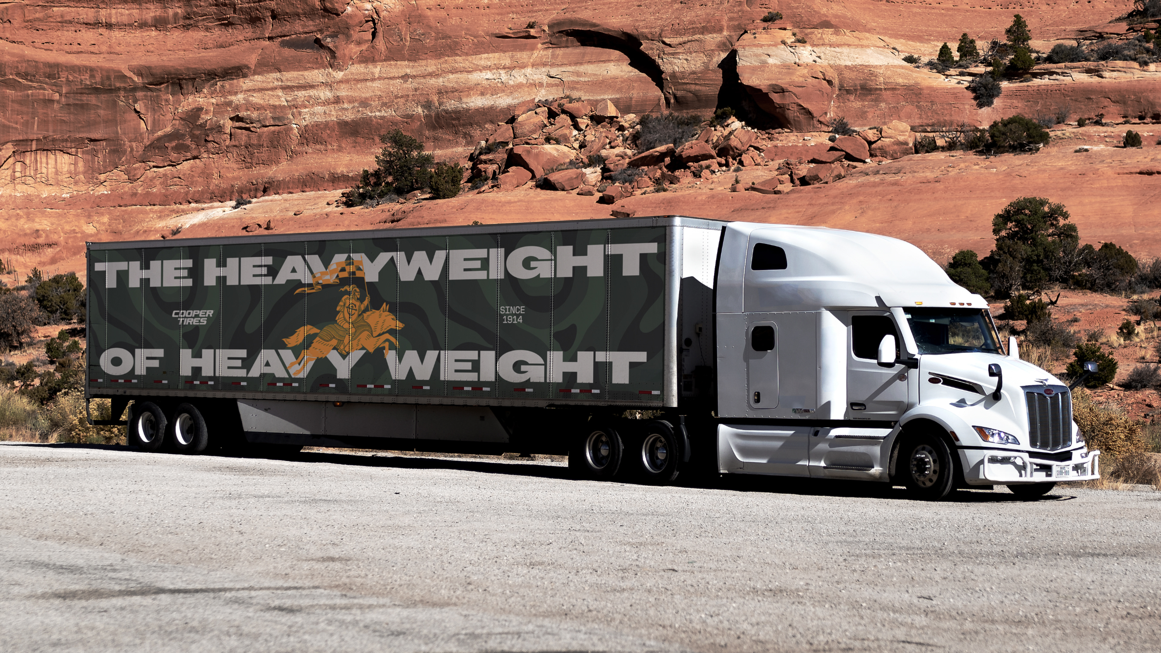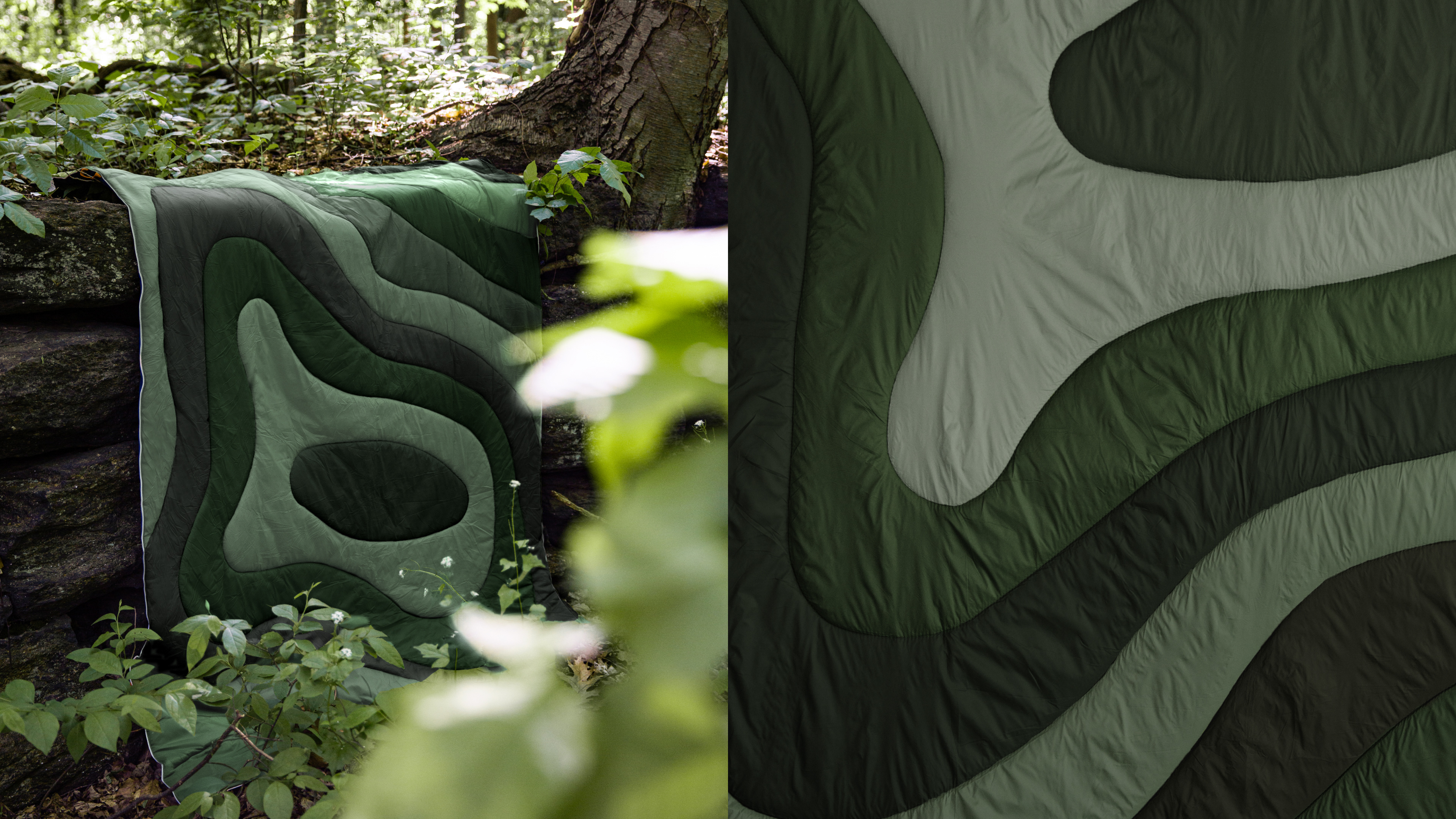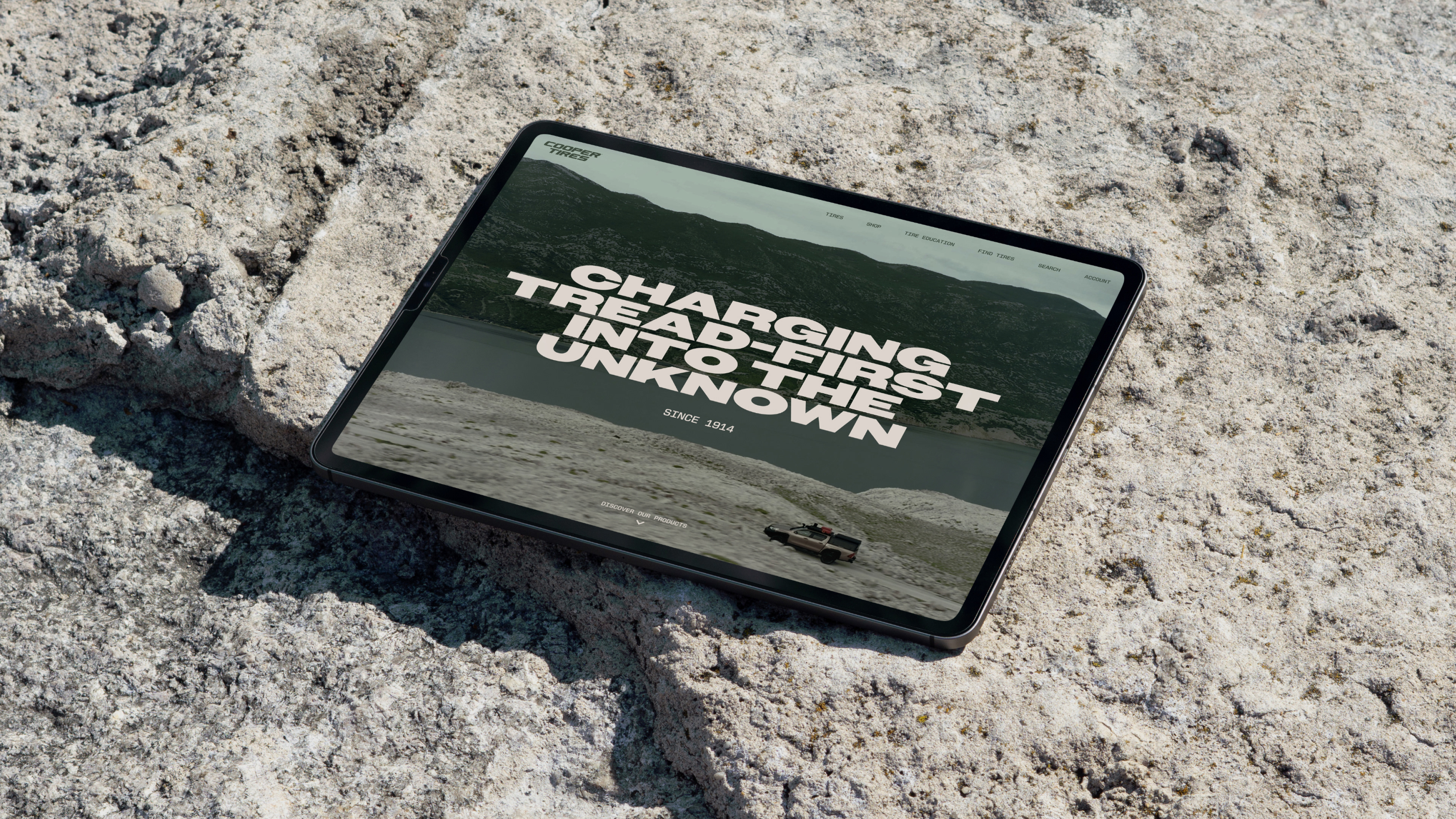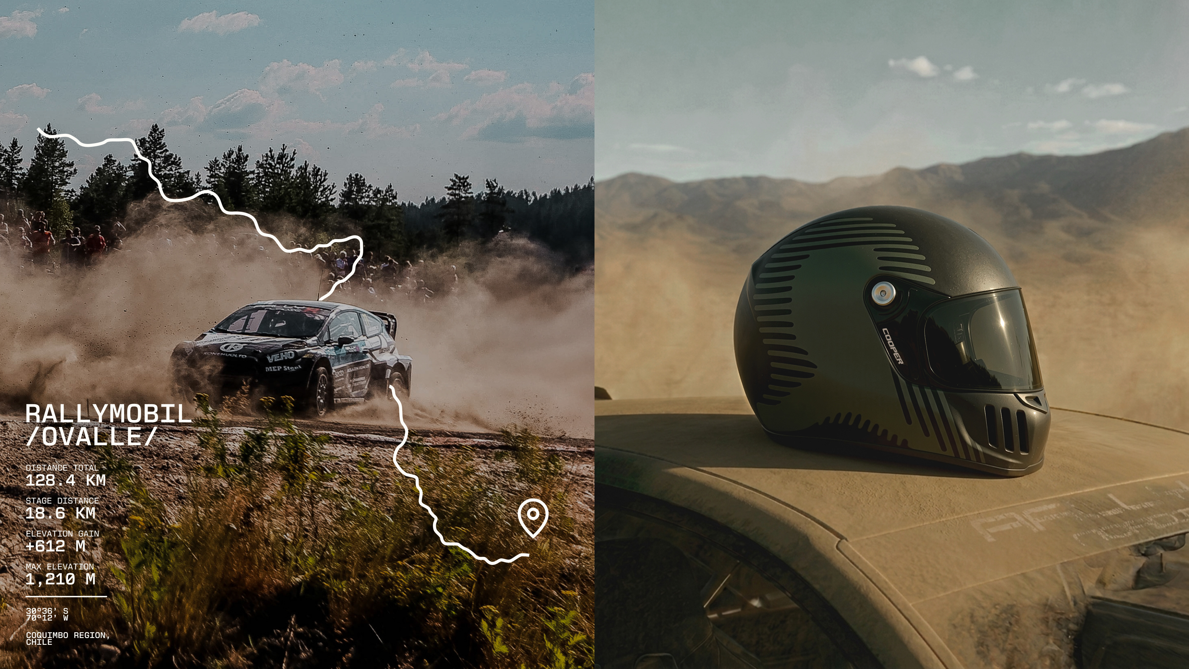
Cooper has spent more than a century perfecting the toughest tire around. The product was exceptional. But the brand no longer reflected it. The challenge was standing out in a crowded global market where the brand had started to blend in.
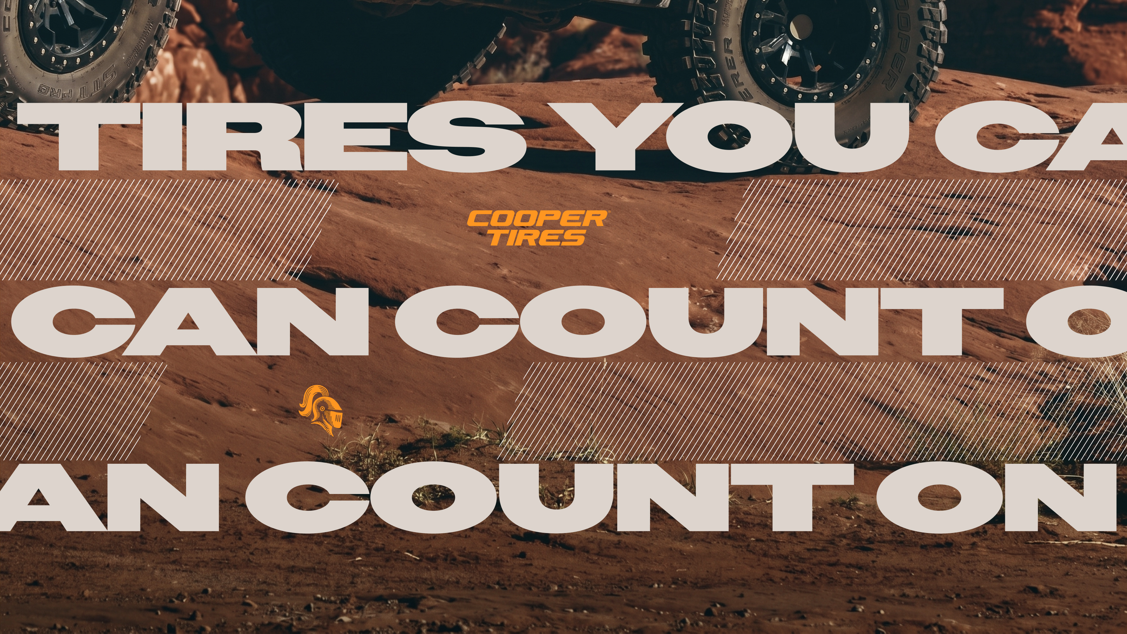
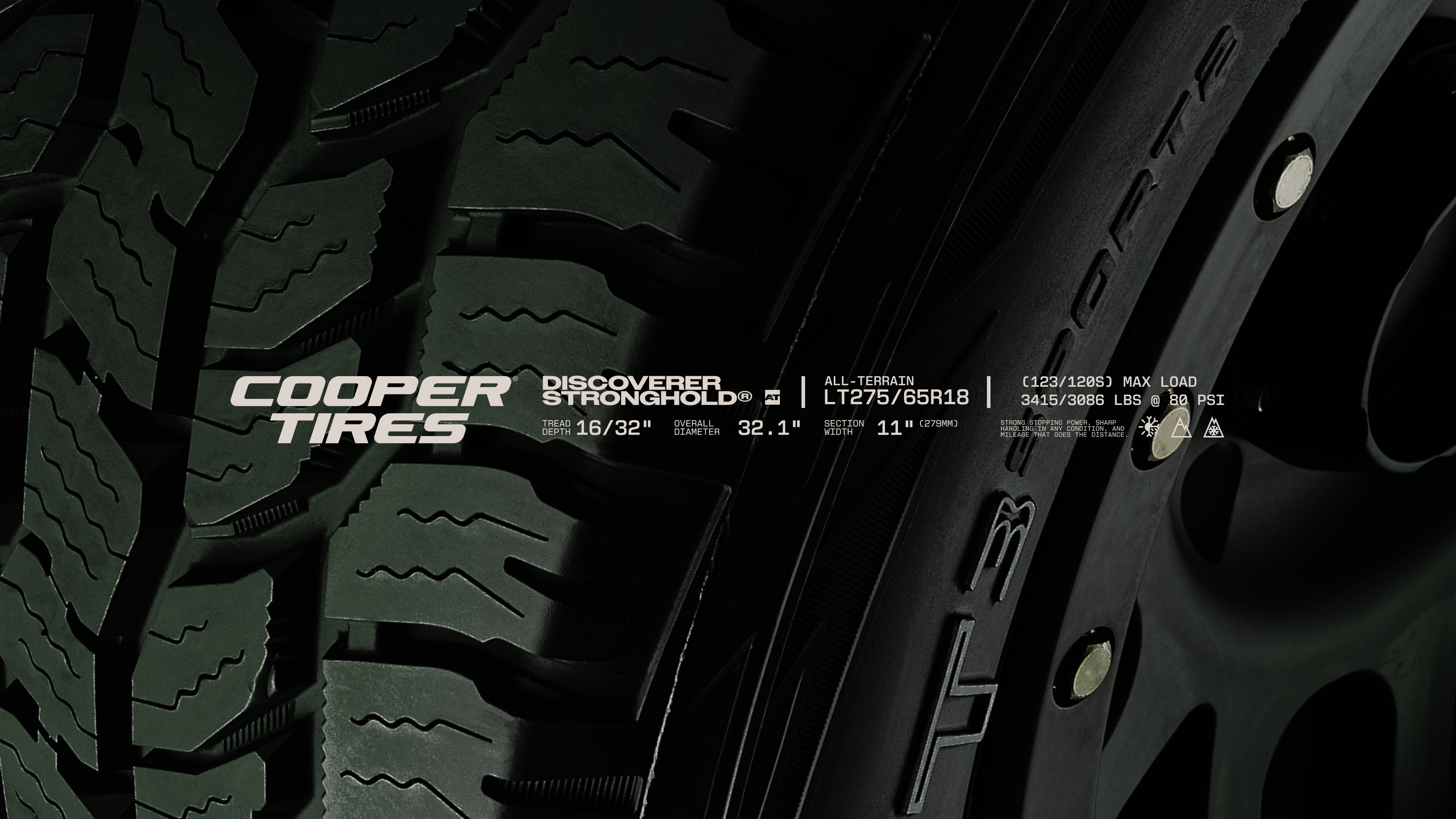
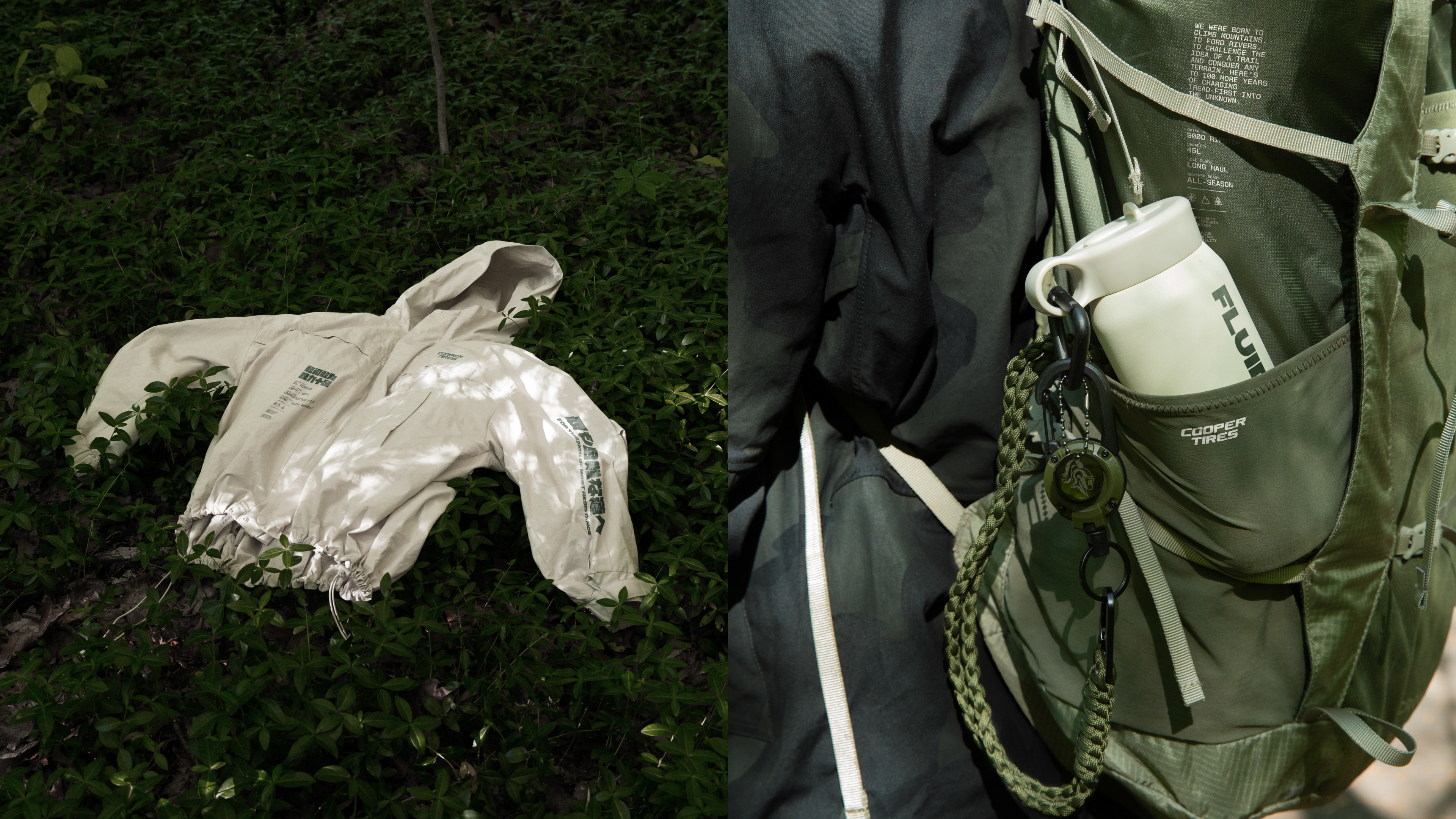
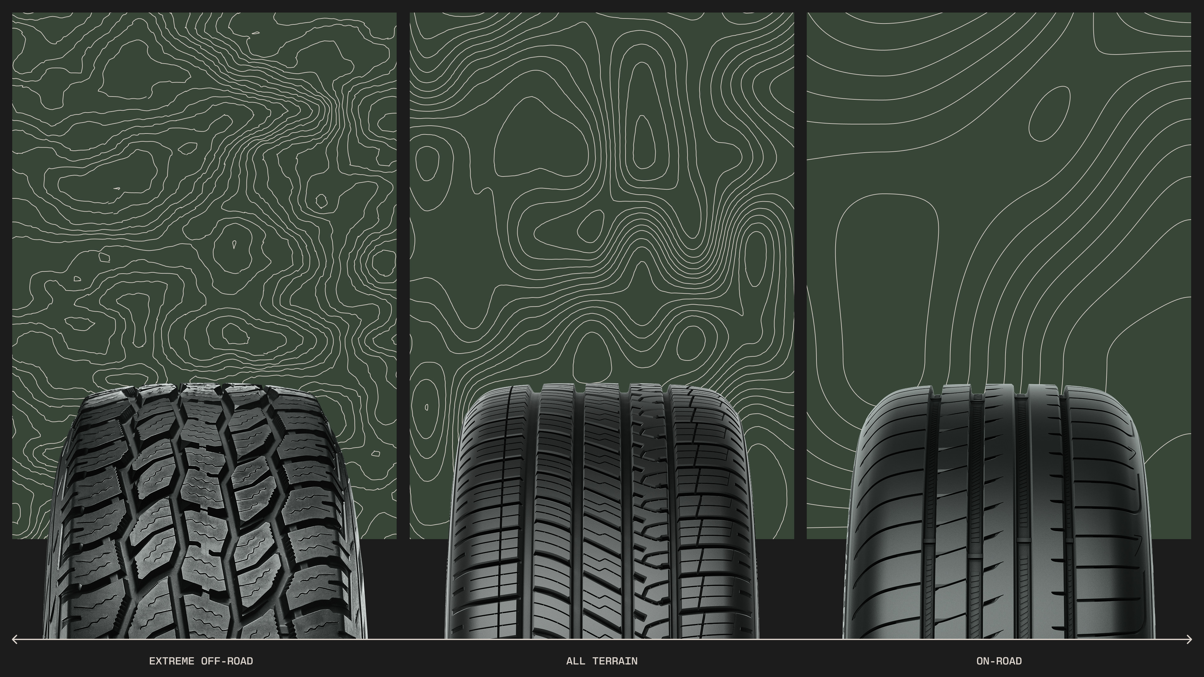
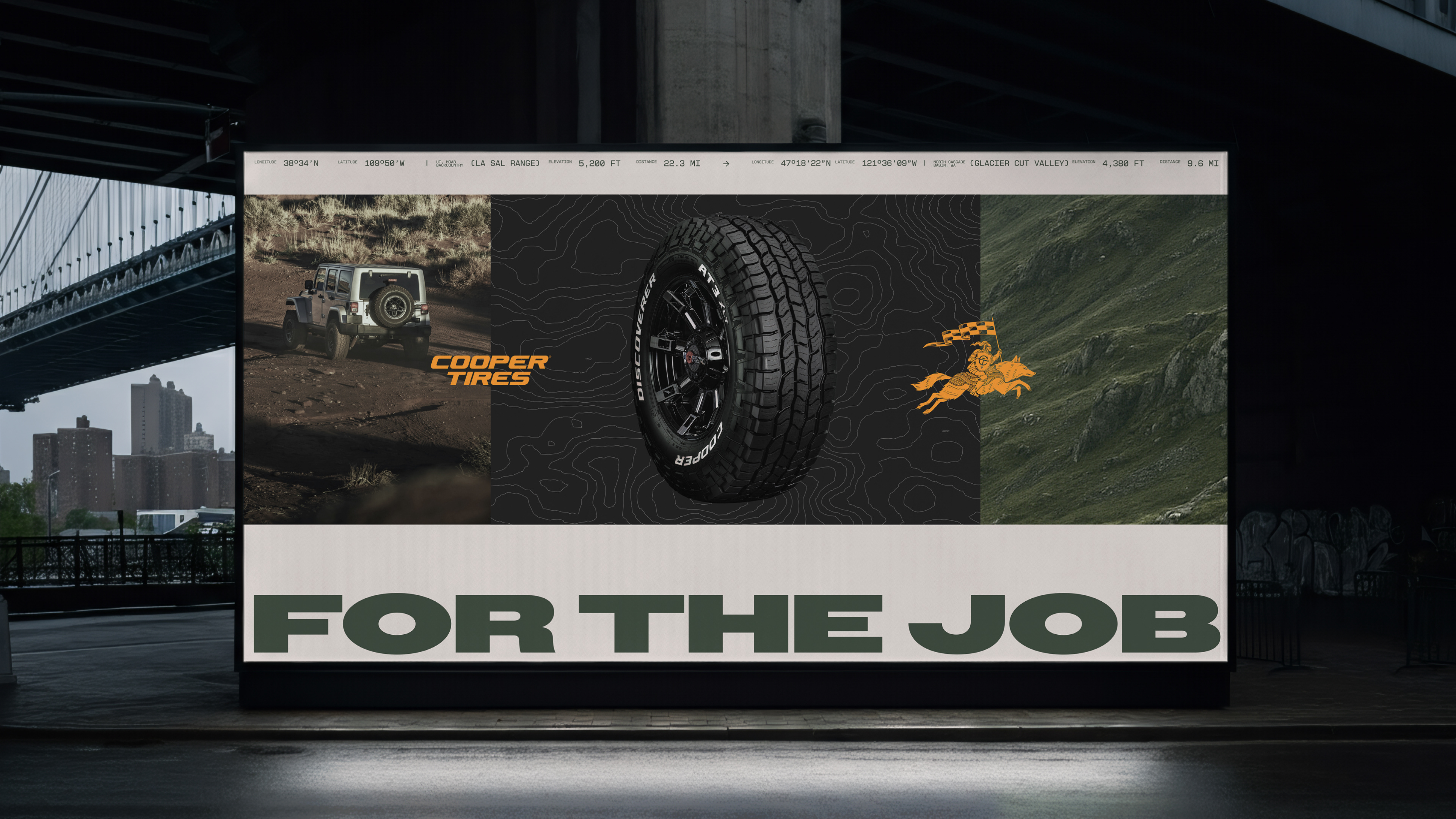
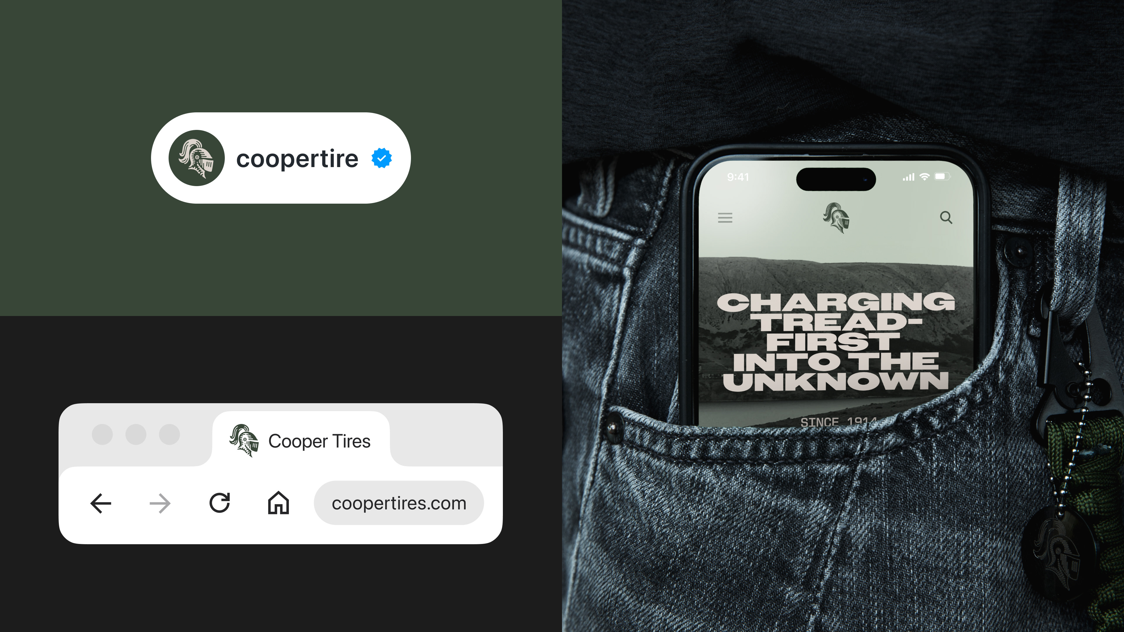
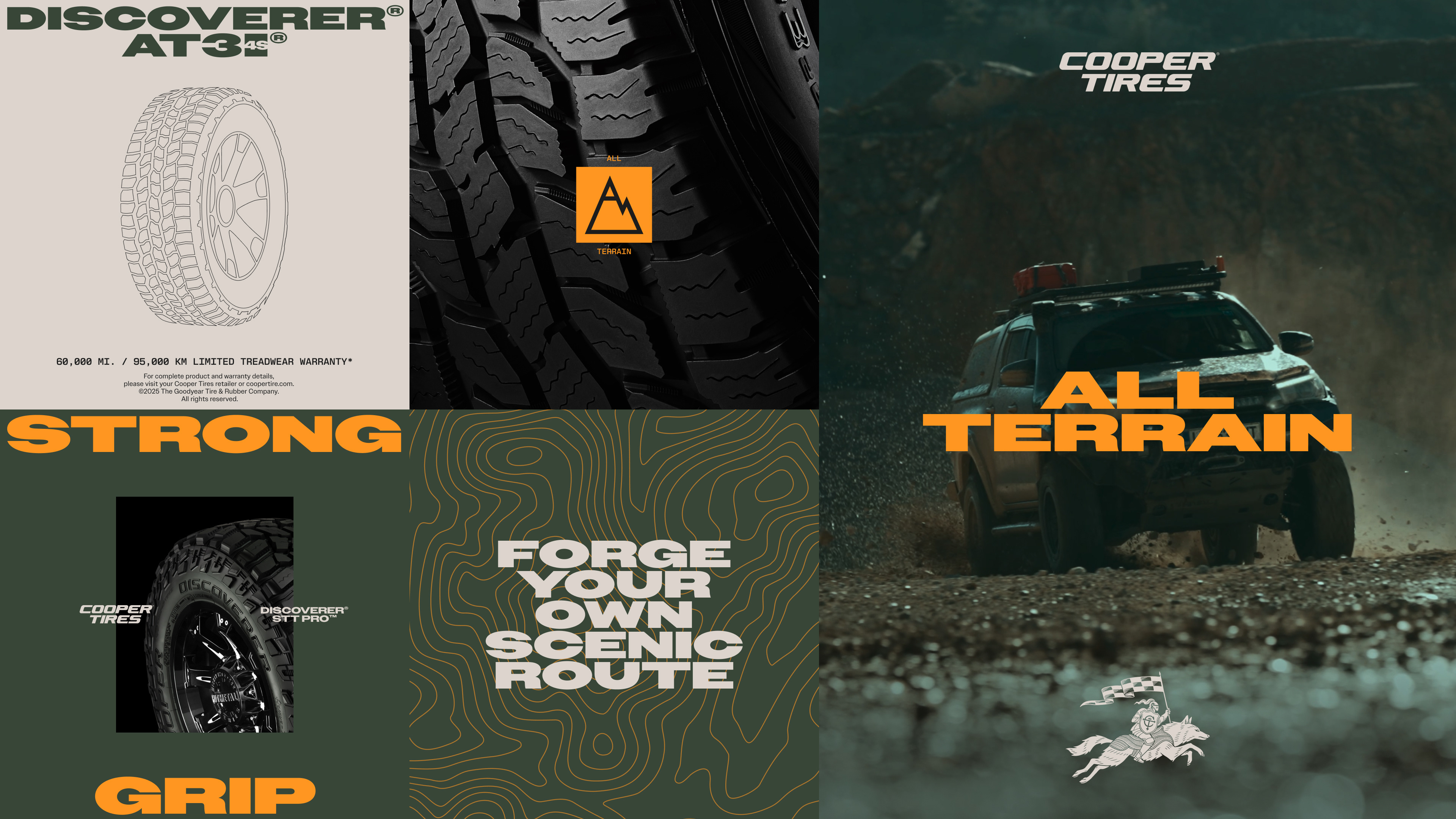
Our solution nods the rich history of the brand while taking inspiration from the product itself. The wordmark and icon take structure and inspiration from the geometry of the tread. A technical typeface draws on the engineering detail of the tires themselves, paired with a bold extended headline typeface that nods to the Cooper Tires logo. A primary color that sets Cooper apart in a category of familiar tones, and points to exactly where its toughest all-terrain tires are made to go: off the road and into the wild.
Our solution nods the rich history of the brand while taking inspiration from the product itself. The wordmark and icon take structure and inspiration from the geometry of the tread. A technical typeface draws on the engineering detail of the tires themselves, paired with a bold extended headline typeface that nods to the Cooper Tires logo. A primary color that sets Cooper apart in a category of familiar tones, and points to exactly where its toughest all-terrain tires are made to go: off the road and into the wild.
A heritage brand rebuilt from its own product–and made unmistakably Cooper.
Logos & Distinctive Brand Asset
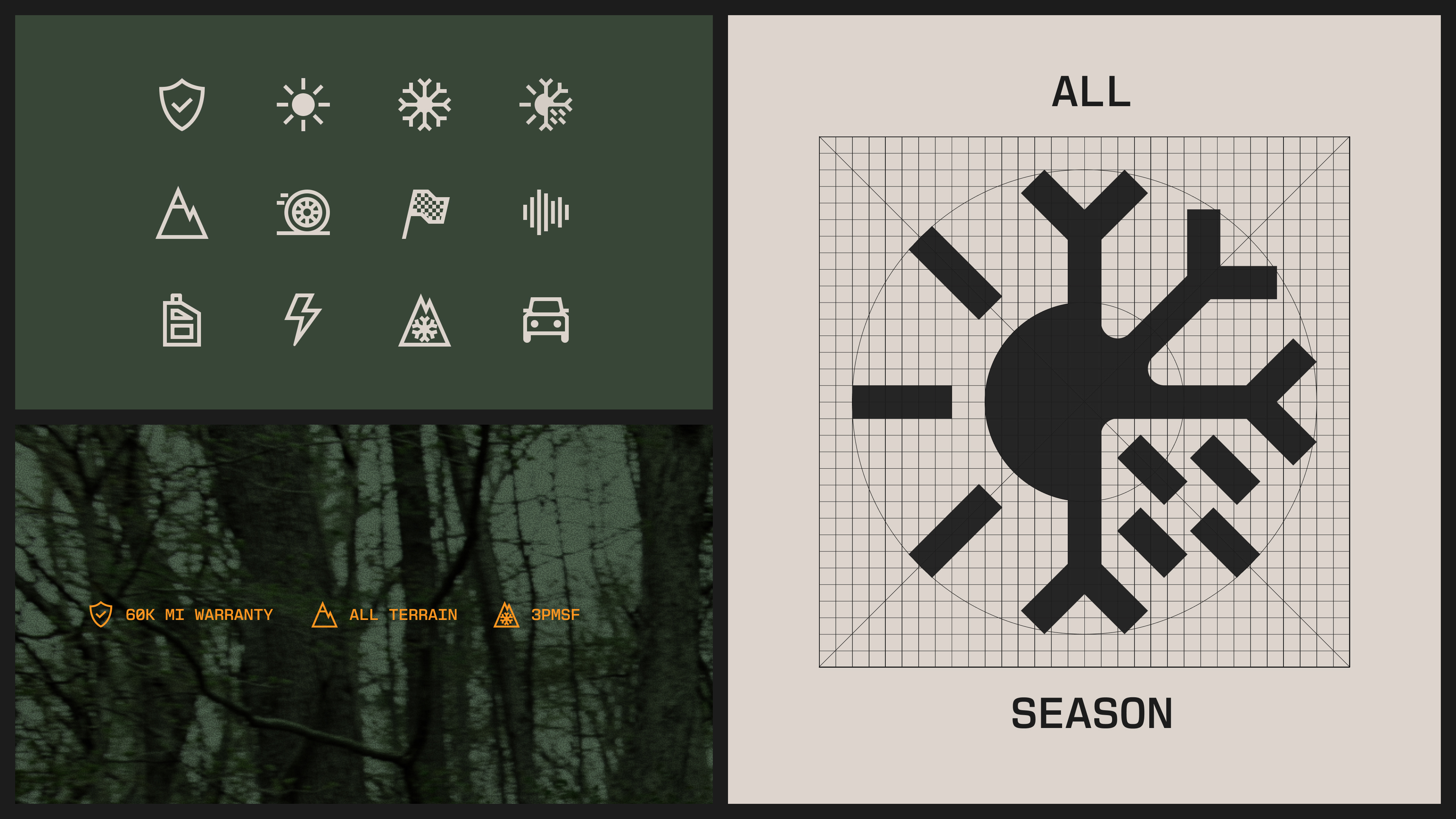
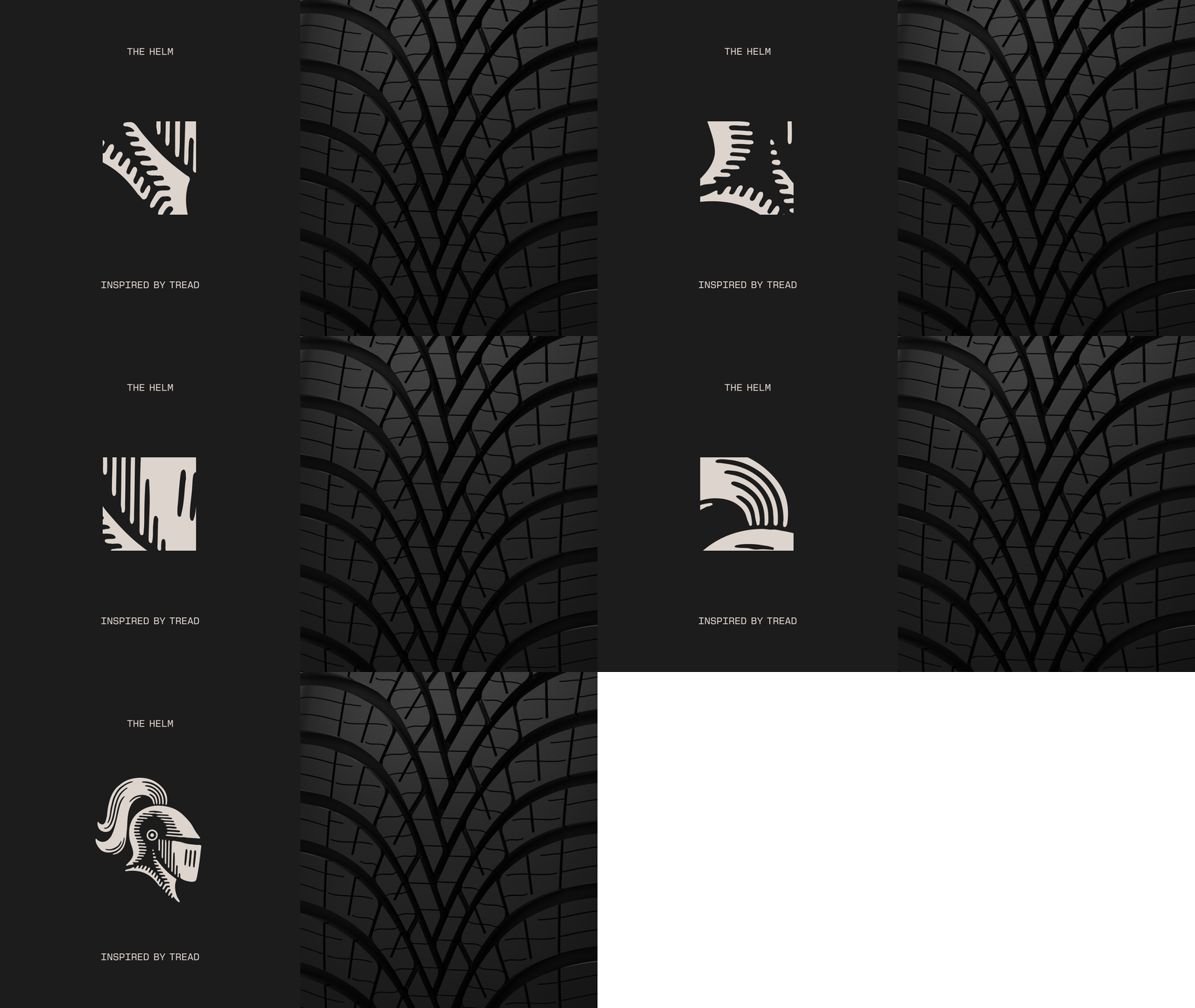
We refined the wordmark to better follow the precise lines and angles engineered into the tread of the tires. The icon and distinctive brand asset draw inspiration from the tread and the way it is designed to move water away from the tire.
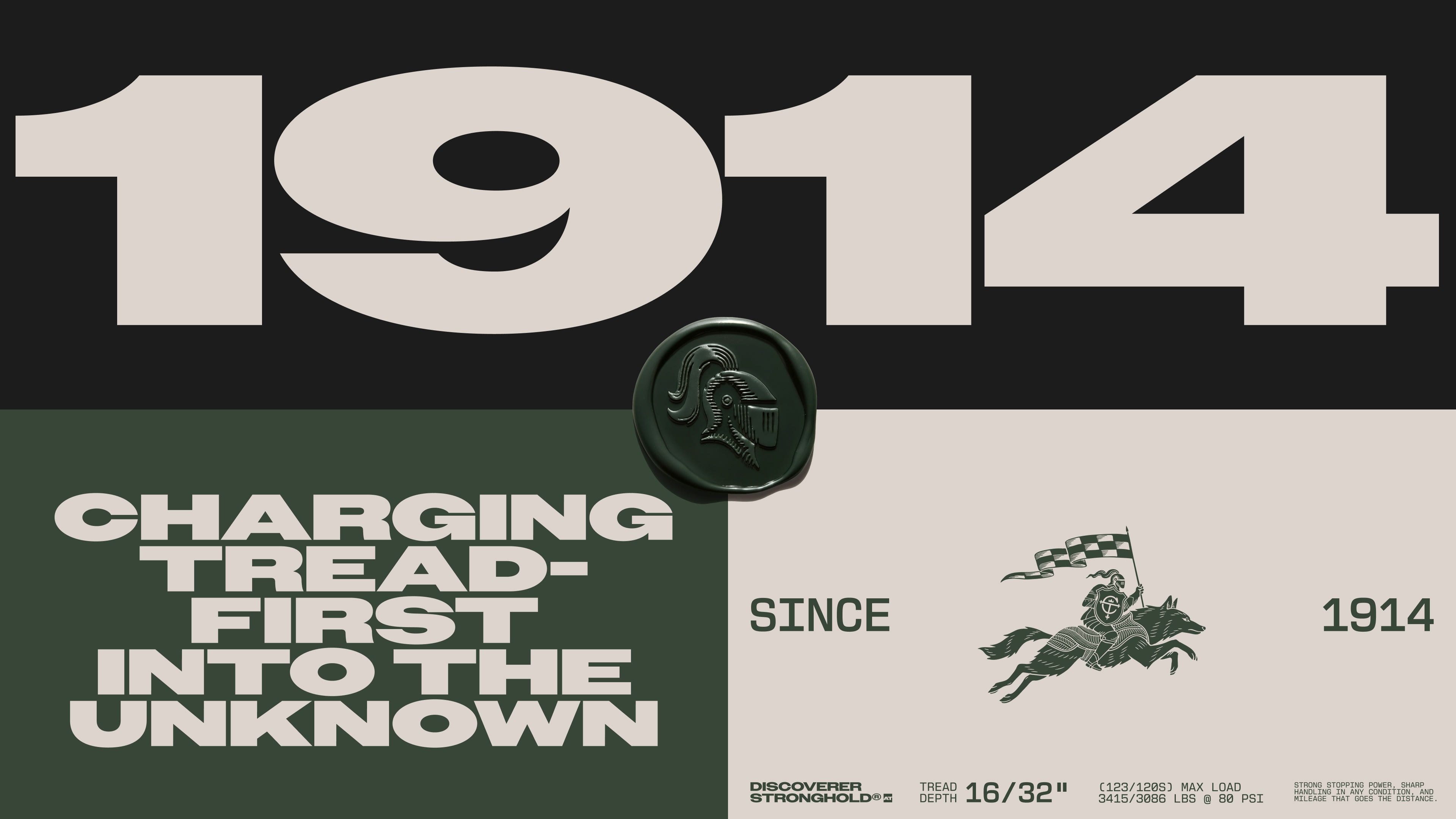
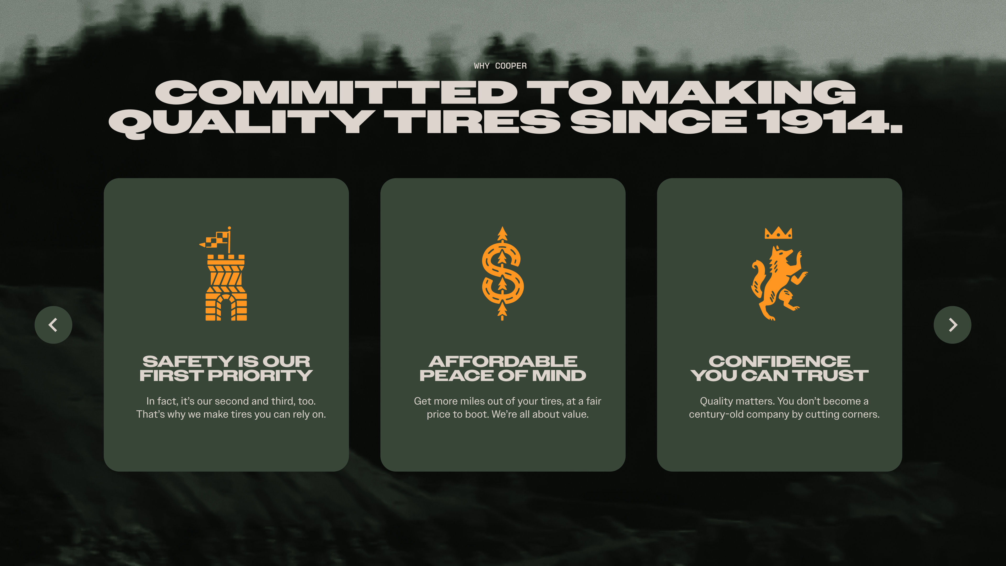
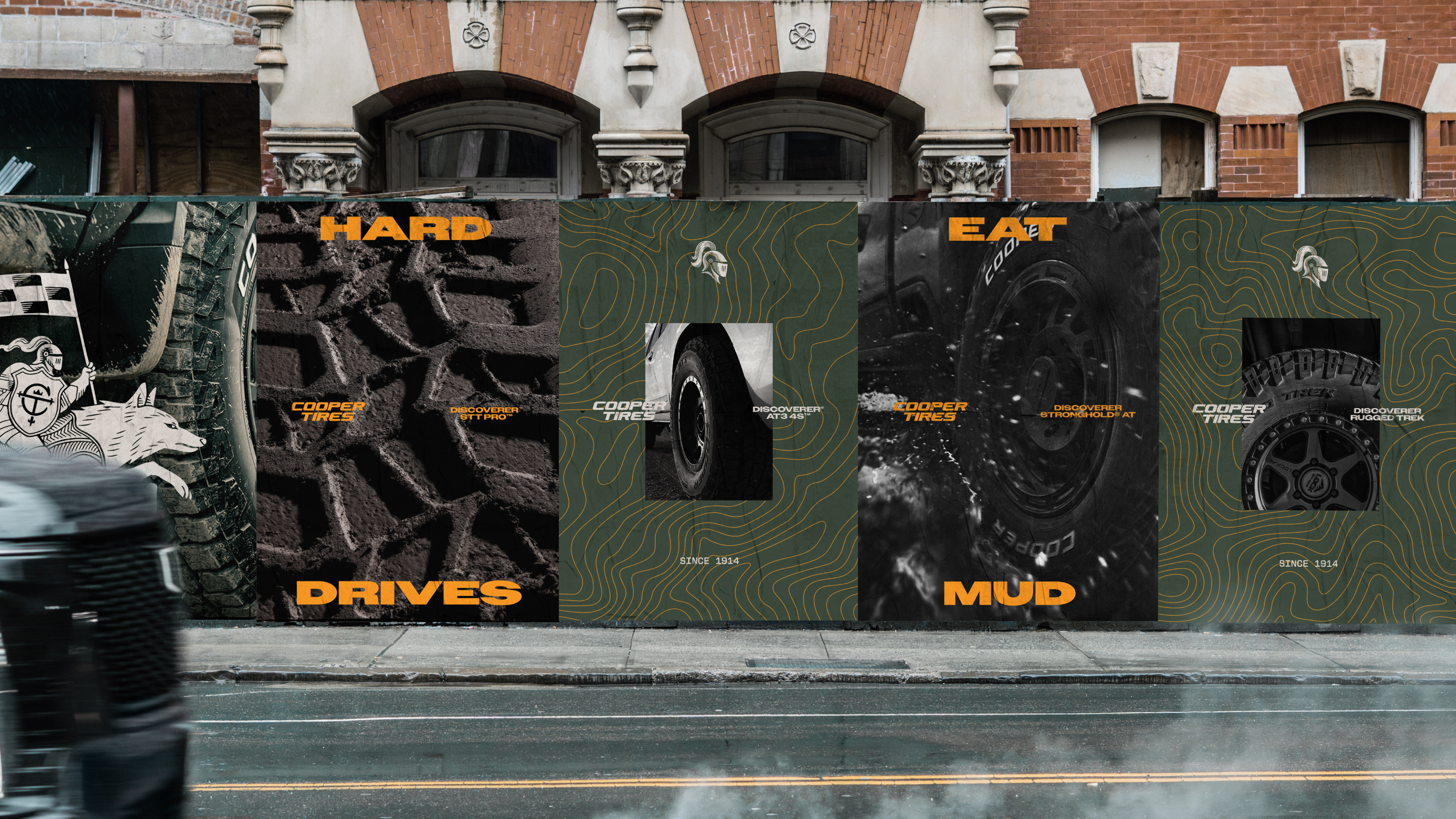
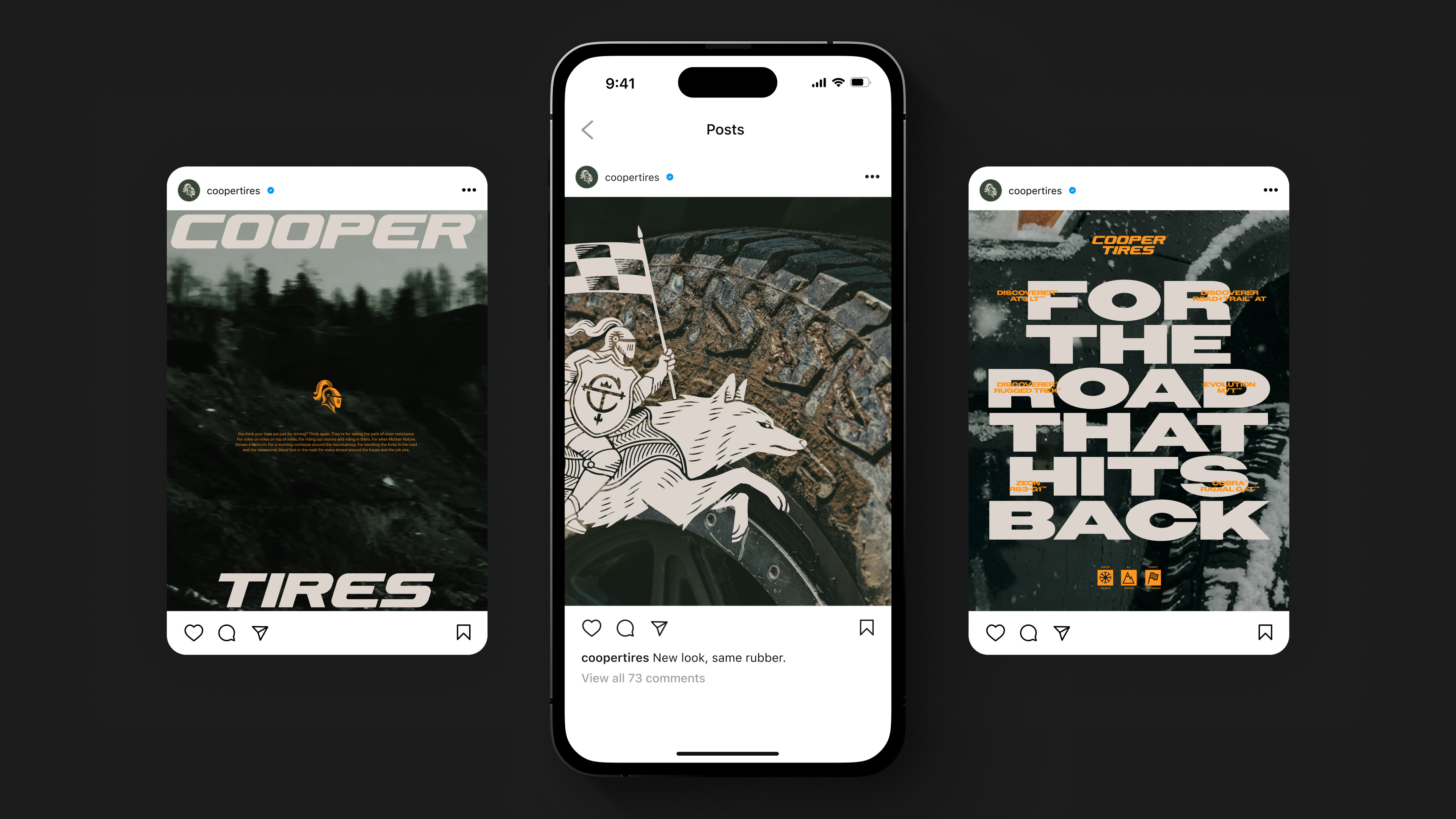
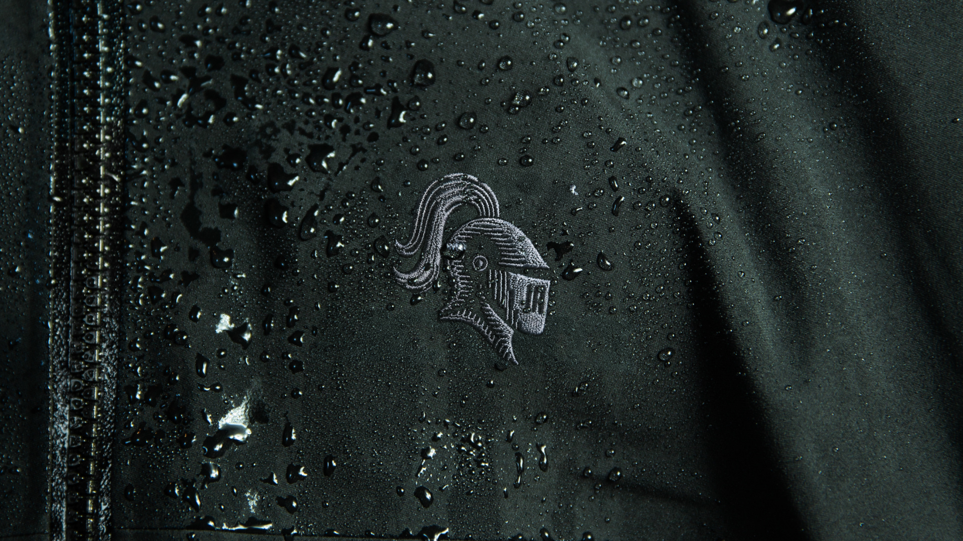
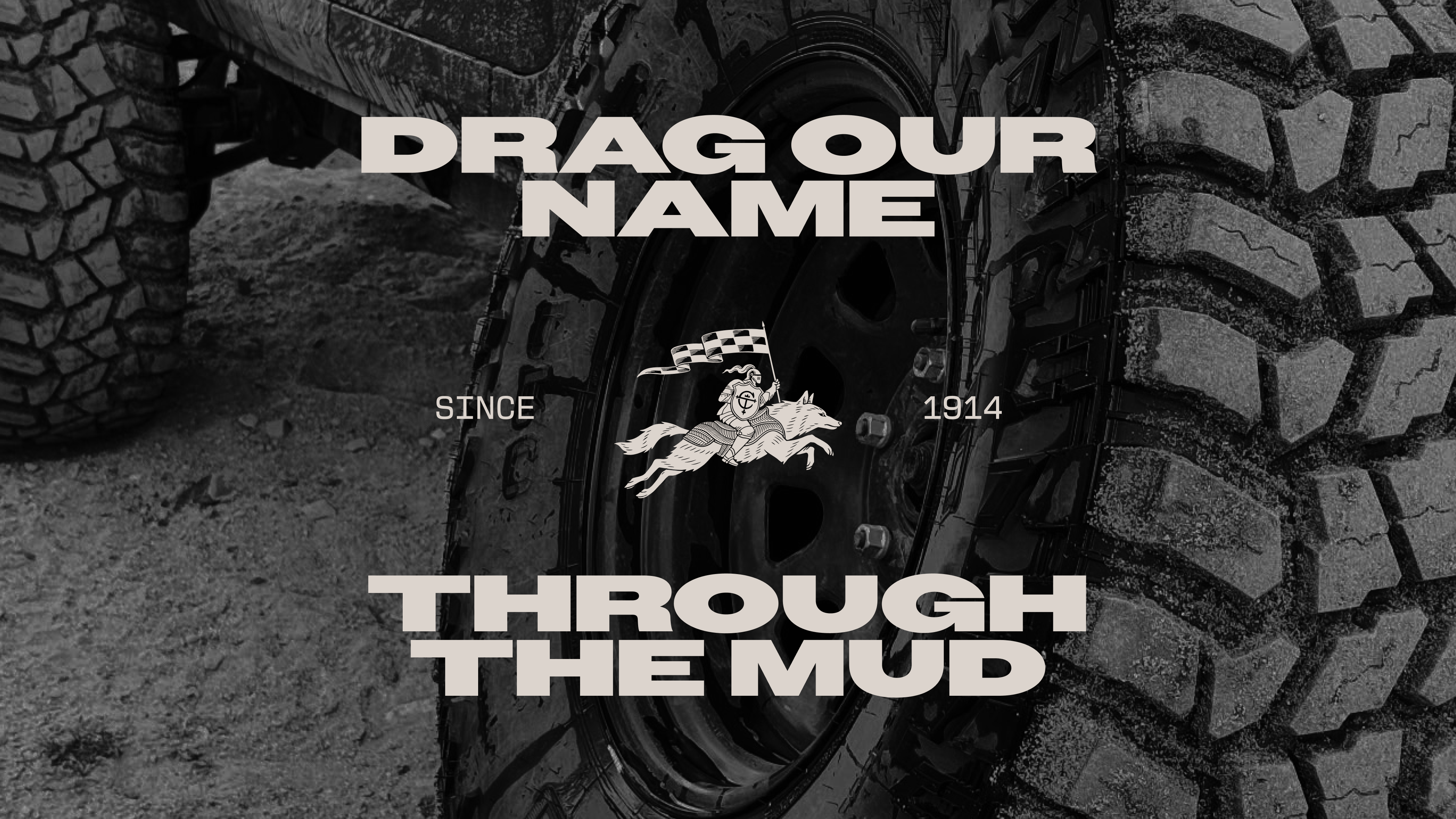
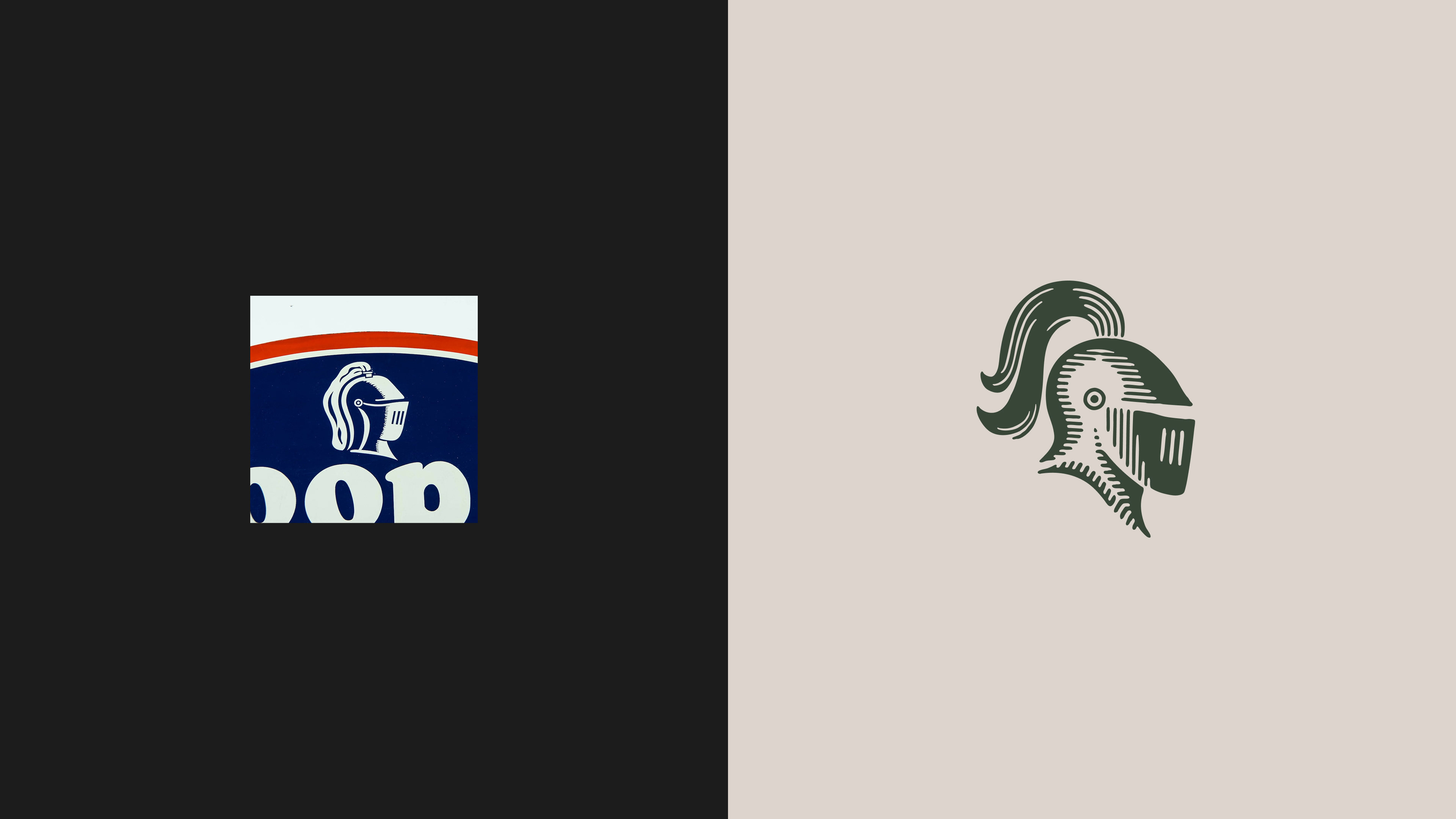
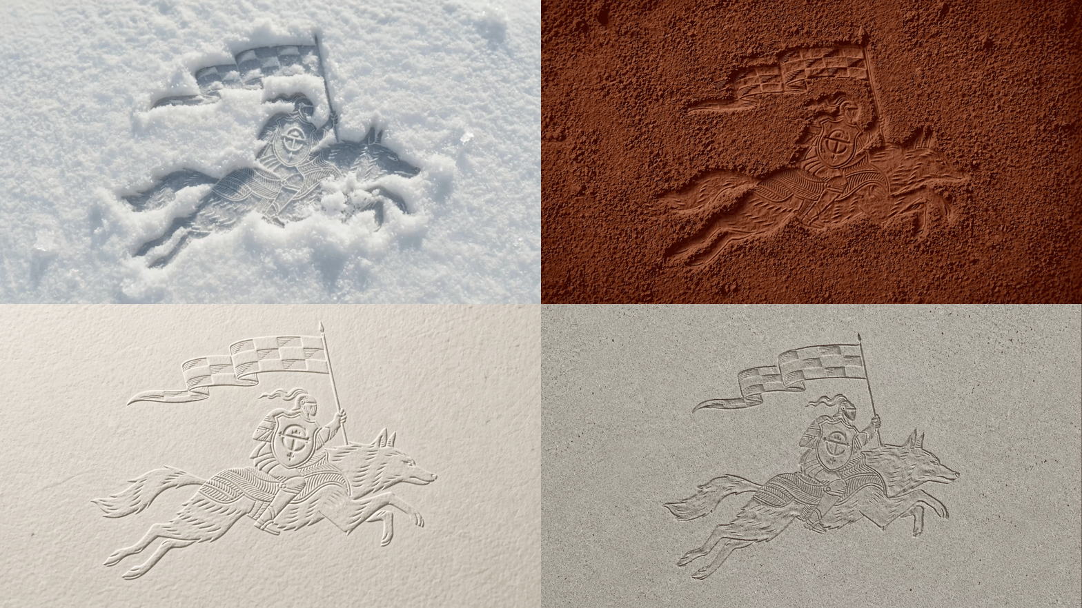
The knight's helm–born from the 1940s Armored Cord tire that made Cooper's name–returns sharpened, and ready to lead. Beside it rides a new figure, the American grey wolf: native to Ohio just like Cooper, fierce and adaptable, built for any terrain ahead. Both inspired by the design of the tires.
Color
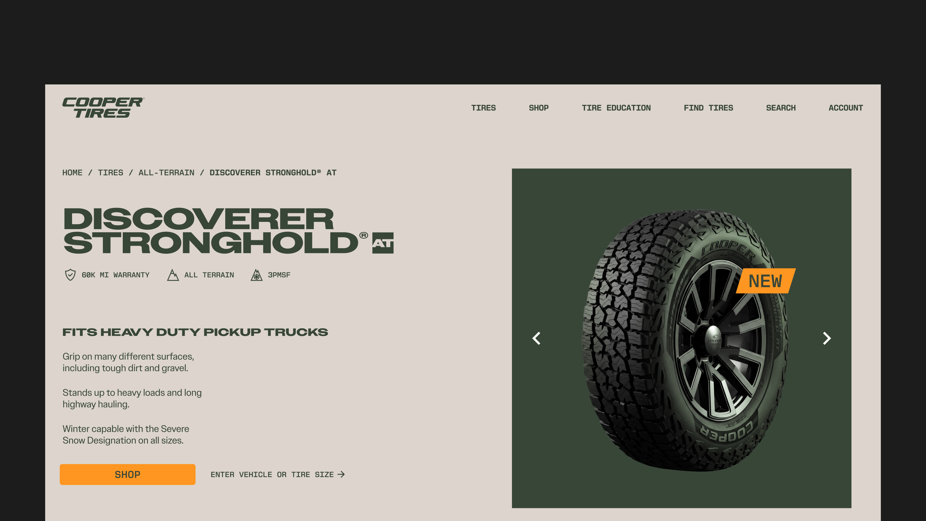
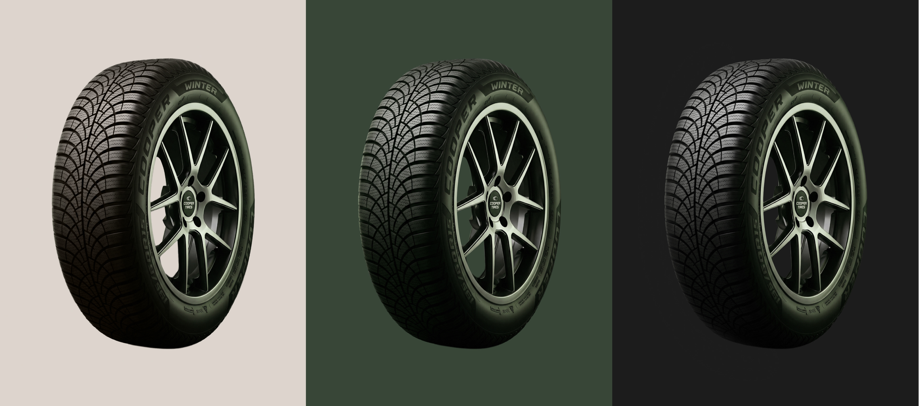
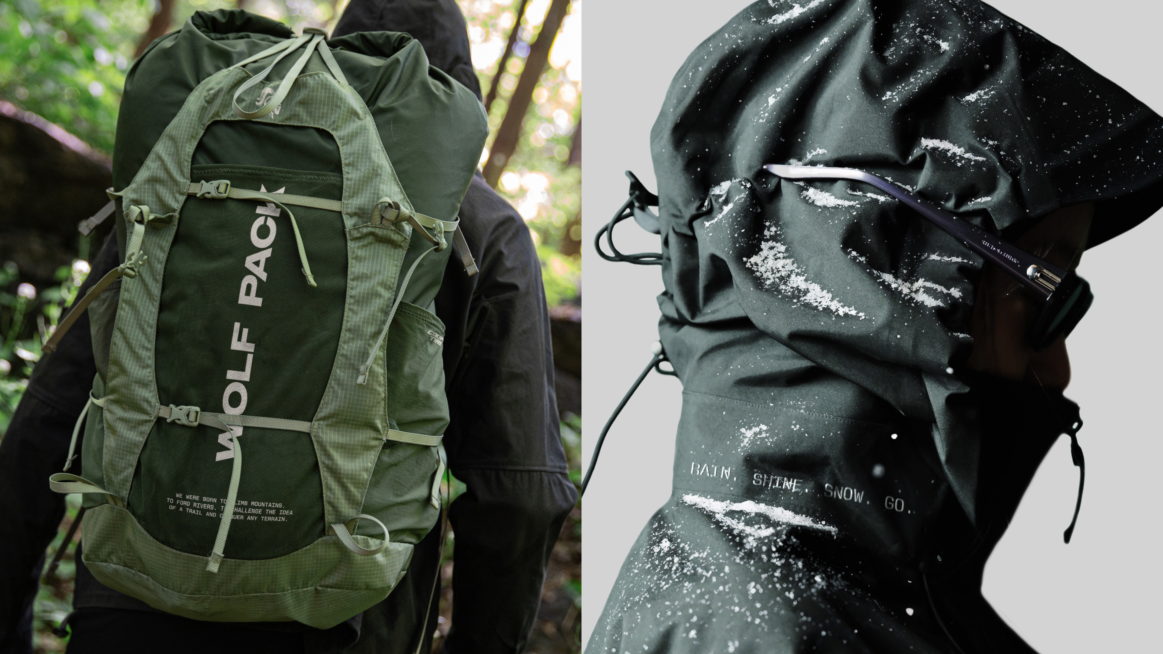
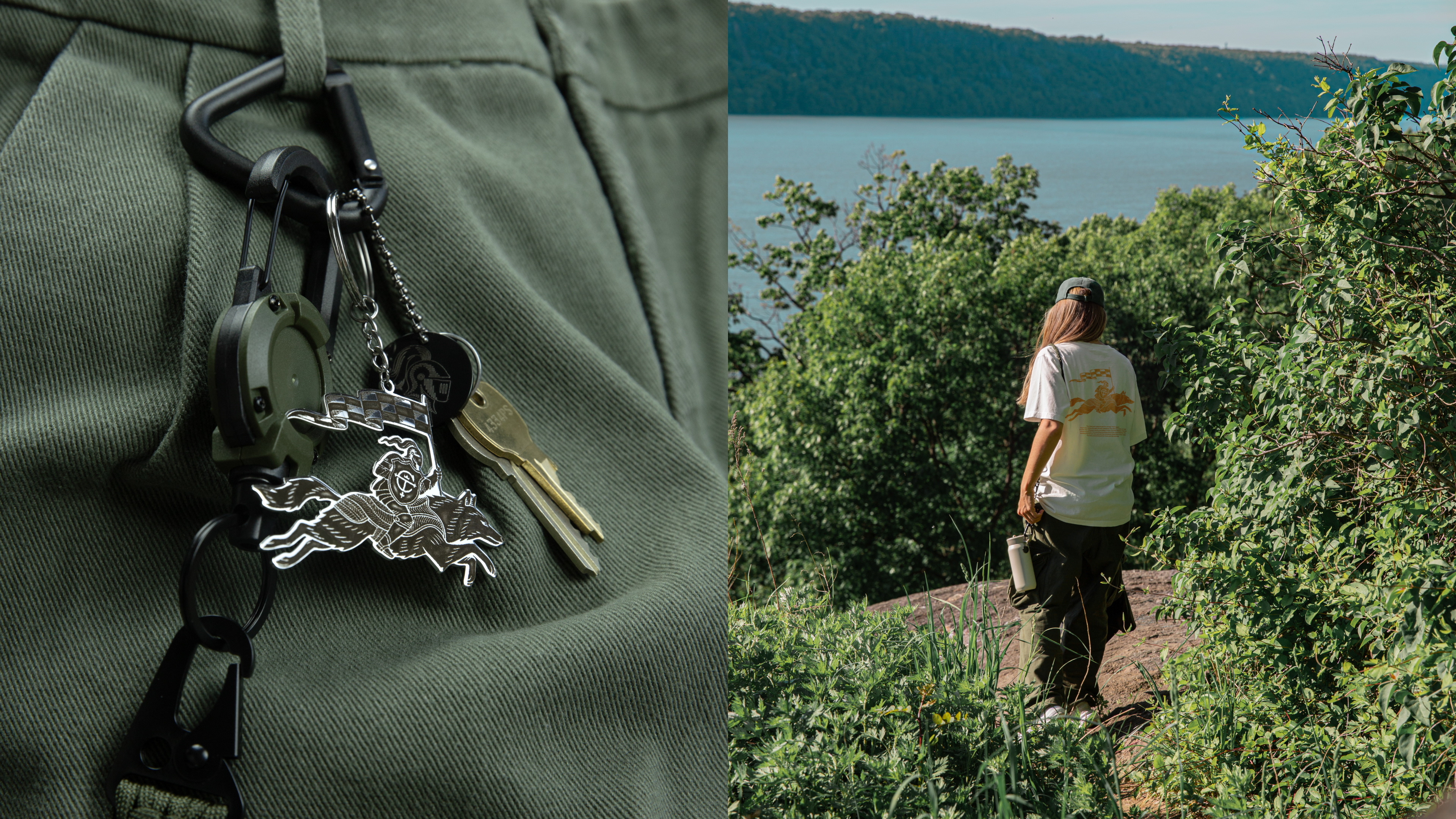
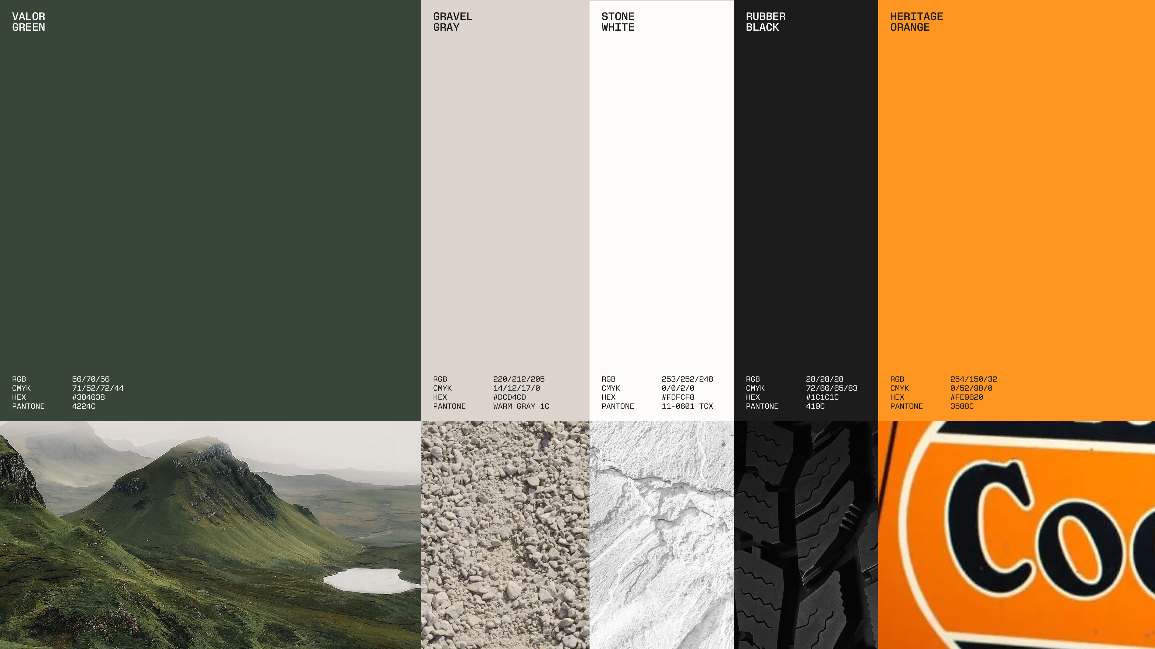
The palette is led by Valor Green–a color that sets Cooper apart in a category of familiar tones, and points to exactly where its toughest all-terrain tires are made to go: off the road and into the wild. A heritage orange accent carries the brand's early character through.
The palette is led by Valor Green–a color that sets Cooper apart in a category of familiar tones, and points to exactly where its toughest all-terrain tires are made to go: off the road and into the wild. A heritage orange accent carries the brand's early character through.
Typography
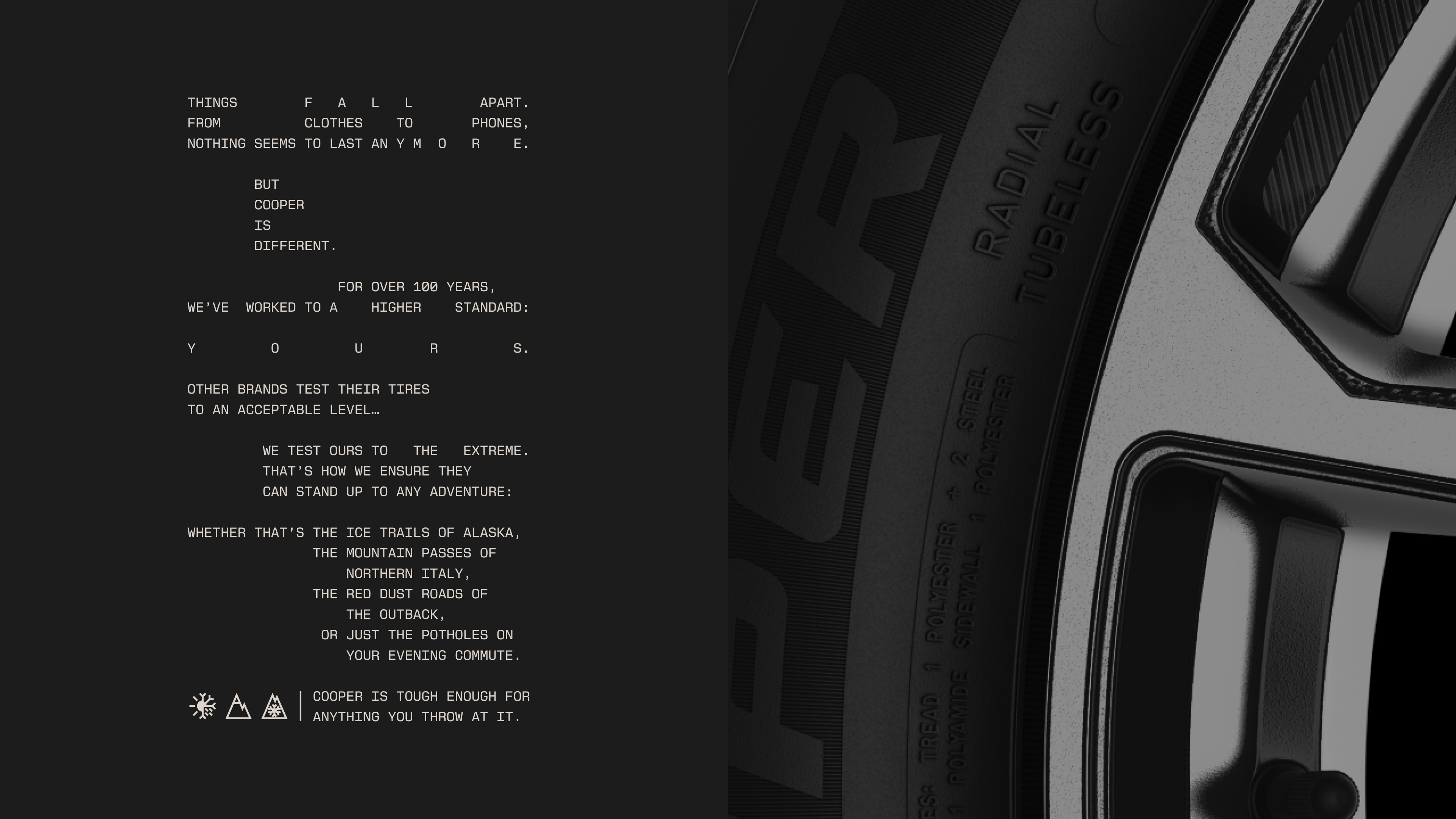
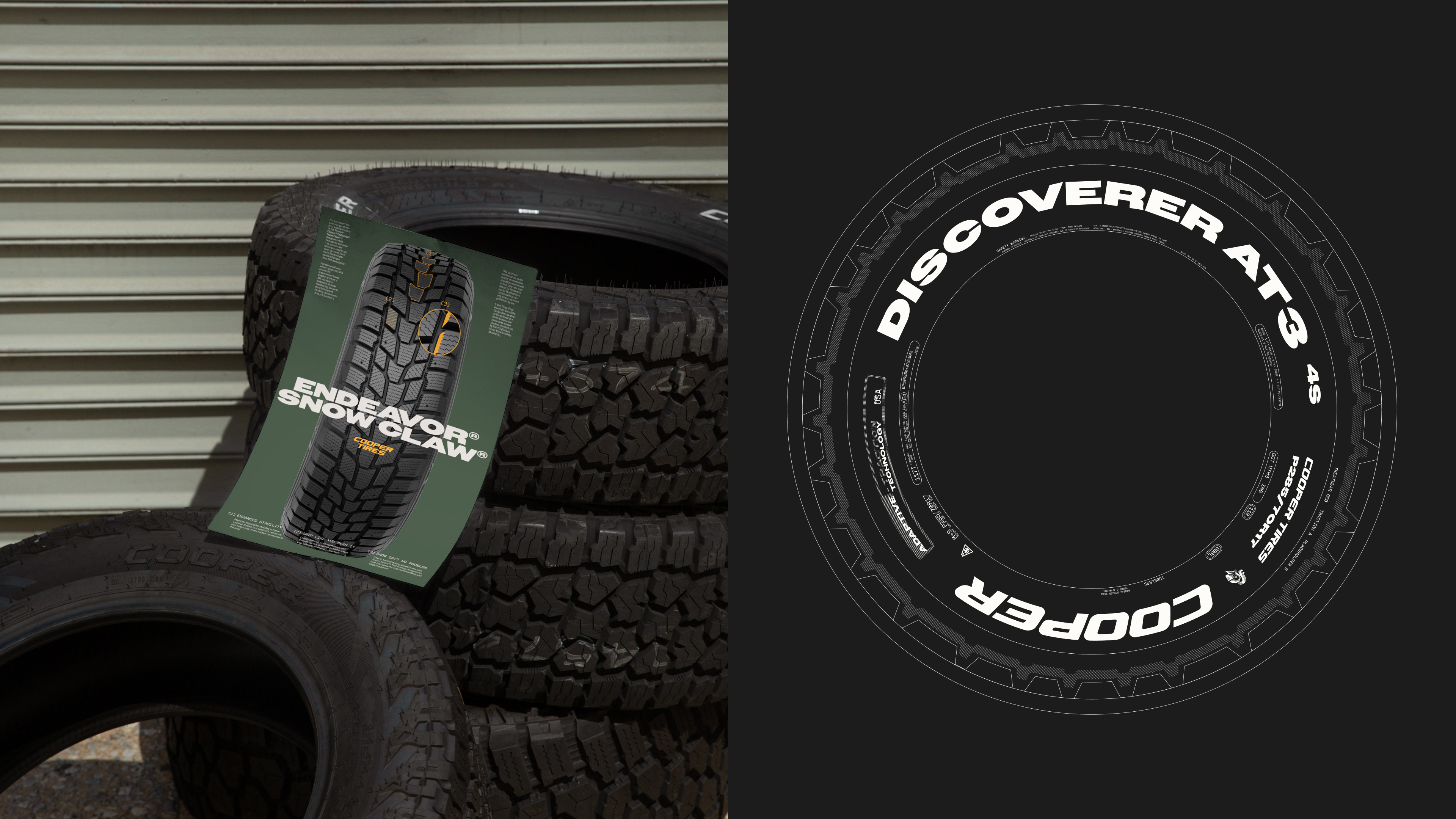
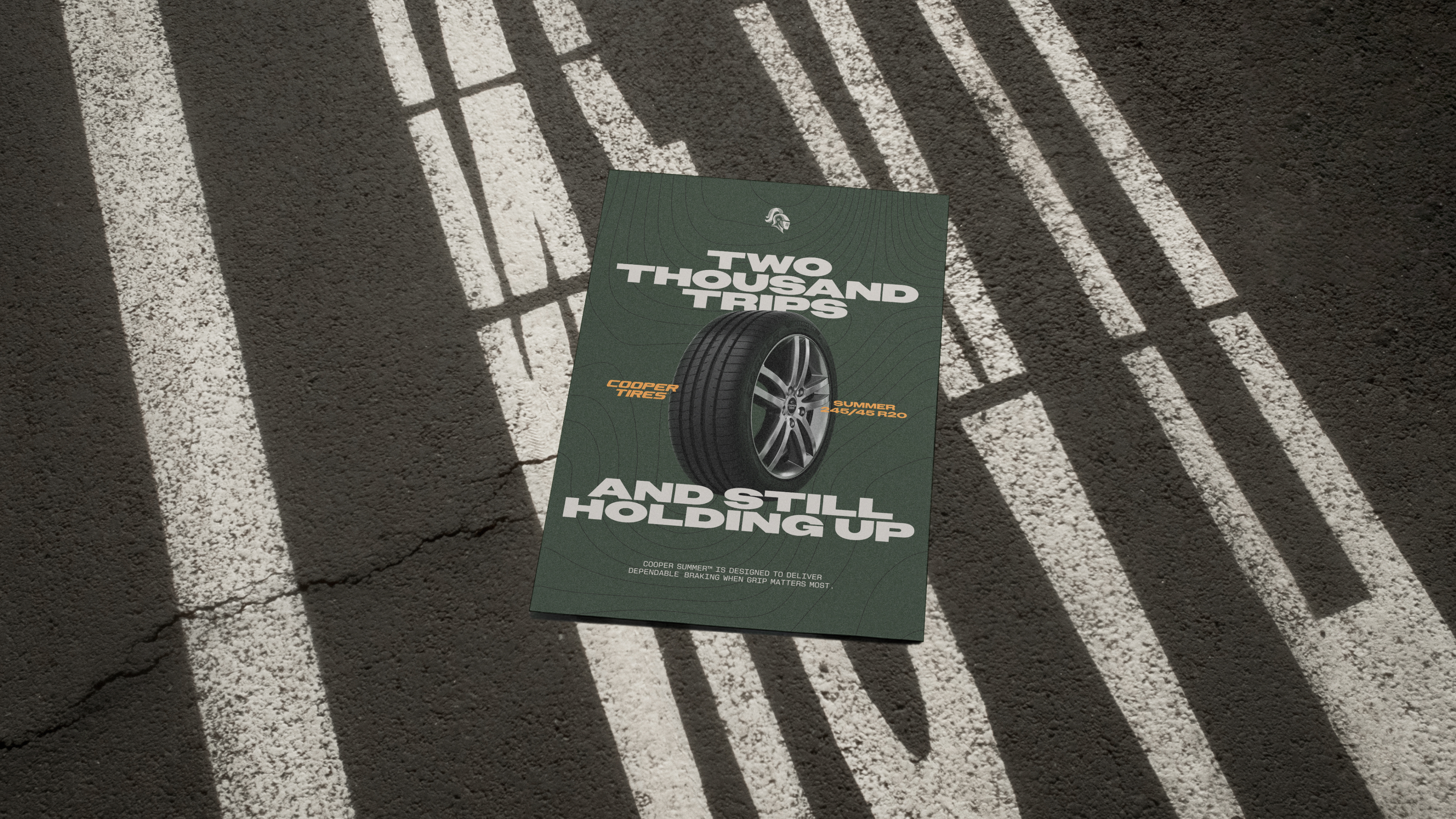
The bold extended headline typeface–a nod to the Cooper logo–was chosen to grab attention and represent the toughness of the tire. This was paired with a mono that was inspired by the typographic details on the tires themselves.
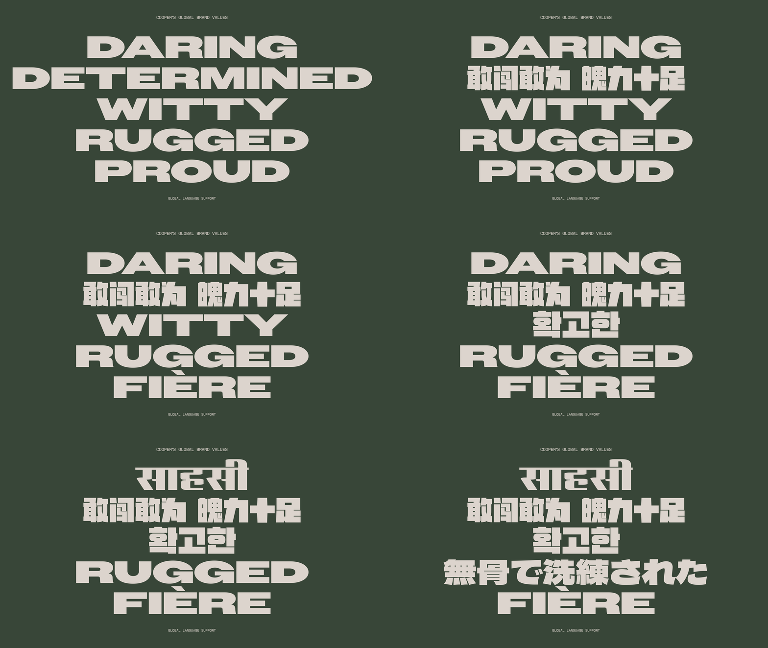
We worked with our partner across our global network to define a set on non-latin typefaces that could be used around the world.
We worked with our partner across our global network to define a set on non-latin typefaces that could be used around the world.